The four attributes of great online benefits communication
Think of a time you visited a website you really liked. Chances are, it had all of these attributes:
 Beauty
- Entertainment
- Engagement
- Functionality
You may not have known how exactly, but each of these engaged you. Whether that meant surfing around the site or simply remembering the brand, each of these features played a role in your action.
Collectively, these instill trust and confidence. And in benefits communication, that goes a very long way.
Through good web design you’ll have your employees returning to your website, exploring and understanding their health plans, inquiring about your wellness services and taking action to live healthier lives.
You’ll get a lot out of it too: Lower health care costs. Higher participation. Increased shareholder returns. Most importantly: A healthier and happier workforce.
Let’s dissect each one to find out how exactly the latest web developers are exploring each theme and how they’re changing the user experience into something with very real results.
Beautiful trends
The modern world can be a pretty crazy, hectic place and beauty relaxes, nourishes and soothes the soul. It is a universal need of mankind, one that goes back to the days when skilled craftsmen and artisans spent hours typesetting holy books, chiseling ornamental features on public buildings and hand-stitching elaborate garments.
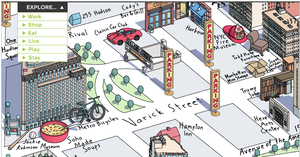
In website design, new trends are always emerging. Over the past year or so, I have witnessed an increase in beautiful sites greatly due to technological advances. One current website trend is to incorporate hand-drawn art. There is also a noticeable increase in use of illustrations, gradients and textures.
 In other words, big boring blocks of flat color are quickly being replaced by more intricate patterns and designs. Another beautiful trend is that designers are paying closer attention to typographic details, such as fonts and line space. Web design is actually starting to look a little closer to print design.
Give them that wow moment
The next attribute, entertainment, is best described as having a WOW factor. It can make you notice something simply for its creativity. A website that showcases some hot new technology or new information in a creative fun way is often shared with others simply for its originality.
I find that often originality trumps beauty as the most valued attribute in design. That translates too often into gimmicks or one liners that quickly fade from favor. These designs are often imitated and become stale or boring when repeated.
This happens a lot with Flash or animation. The flash script is copied from one website to another and by the fifth time you see this animation, you simply want to close the website or your eyes!
Get them involved
I strongly believe that good design is engaging in much the same way a speaker can be engaging. It is meant to connect people. An object, flier, website, room, building or logo was designed to be seen and experienced by people.
Design is most engaging when it provides a sense of exploration or some novel experience. It becomes engaging by use of some of the design principles that include: line, shape, scale, texture, materiality, color, space and form.
An engaging website is one that invites the visitor in, keeps his or her attention, and is convincing. A site must be easy to navigate and have strong visuals. It should make the user feel their time is not being wasted and that they are receiving the information or entertainment they were searching for.
 But, does it have a purpose?
The last attribute, functionality is extremely important in design and is the attribute that most separates the world of design from fine art. The object, website, building or brochure designed is meant to function and serve a purpose.
For example, a chair is built to be sat in, a building is built to be occupied, a website is made to convey information or entertain. I believe “form follows function.” This principle, coined by Louis Sullivan in 1896, states that designs of a construction would be based on the intended use to which the constructed site would be put to use. In other words, aesthetic considerations in design should be secondary to functional considerations. A designer must create something to appeal to the target audience of your client.
In web design, content and interaction should be the first priorities over choice of fonts and colors. The use of icons is extremely functional. They are easy to recognize and quicker to read than text. Because icons can represent whole sections instead of words, it adds to a site’s appeal and increases the chance a user will spot and visit the area of the site that interests him or her.
By incorporating these four attributes in your company’s branding and collateral, design can capture the attention of the user and transfer the intended information in a memorable and effective format.
Work with Us
We partner with organizations that value their people first. Let’s talk.
