Great Design Does What Words Sometimes Can’t
We know how important health care decision-making is and how much responsibility individuals have, yet few know the basics of calculating their annual health insurance costs or even deciphering a medical chart.
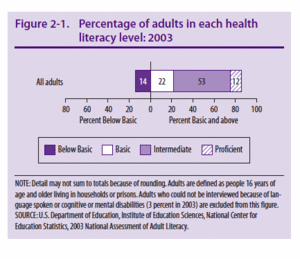
The latest study of health literacy in America showed only 12% of American adults are proficient in health literacy skills, while an astounding 47% of adults don’t understand the most simple and fundamental information presented to them in copy and graphs.

 People need to become better educated about the decisions they make—and we need to use every channel available to make that happen.
This is where great design is invaluable.
Design helps illustrate not just complicated concepts, but simple information. Where words fail, design steps in and provides a different look at the same information, giving people—who absorb information in very different ways—another chance to “get it.”
But good design is so much more than putting pretty colors on a page, or pushing things around until they look good. There is a lot of thinking that goes into good design, a lot of strategy and a firm understanding of how people approach information visually—what stimulates our senses and brains.
In the health care industry, in particular, you have to engage your audience, get them to care, help them understand complex issues and inspire them to action.
Take GE’s healthymagination campaign. The healthymagination website is about “… becoming healthier, through the sharing of imaginative ideas and proven solutions.” GE is pulling resources from all fields of communication and science together in a multitude of innovative projects, many of which you can use to make healthy lifestyle choices or decisions about your health.
The whole site is a best-of-breed example of communication where design, technology, and science come together—using each to its fullest. Strong visuals communicate complicated concepts in ways simple printed images or descriptive paragraphs could not. The breath of the information is also impressive.

 The same campaign, however, illustrates a point all designers must remember—don’t go overboard.
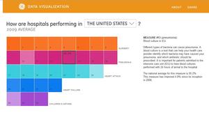
While looking at the “Measuring Hospital Quality” graphic, I was taken by its beauty. This is a stunningly beautiful and fun part of the site—lots of things happening when you roll over the graphic, lots of info, and color, oh so pretty.
Problem was, I couldn’t figure out what I was looking at. I couldn’t make sense of the graphic. Now, I am one of those people who can take a quick look at a problem situation and grasp what is going on. It’s one of the things I pride myself on, the ability to get what is going on really quick. But as I was trying to decipher what I was supposed to get out of this graphic I felt lost. After spending significant time on the site, I was finally clear on the graphic. But, I couldn’t help but wonder how many other people felt like I did when they came across this graphic, and, what they got out of it.
This is where we have to balance beautiful design with actionable, relevant information. It’s a mistake to design for design’s sake. When form overtakes function, design goes out of balance as much as when design is not taken seriously.

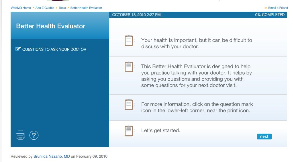
 An example of good balance of design and function is the “Better Health Conversation Tool,” a tool created by WebMD to help prepare patients with a list of questions and talking points for their next doctor’s visit.
It’s not necessarily the prettiest—but it’s incredibly well designed and helps users navigate a potentially difficult topic.
And ultimately, that’s the focus of good design—to help people engage, to help them to act, to help them make good decisions about their health and future when words just aren’t making that connection.
I encourage you to look through the healthymagination website, it has many more great examples of how design can enhance a user’s experience and provide clarity on complex issues—two things we want to do on every piece we touch.

SVP Communications Leader
