

Everyone knows IKEA as a leading home goods retailer with a knack for creativity. But IKEA’s reputation extends to the realm of marketing, where it’s recognized as a trailblazer. The Swedish superstore pushed the marketing envelope when it renamed its products after the frequently Googled problems those products solve. Previously they’d been named with common generic descriptors. So “white daybed with drawers” became “my partner snores.” While IKEA made these changes tongue-in-cheek as part of its “Retail Therapy” campaign, they’re a great example of how factual can morph into practical—with outstanding results.
Design Thinking Applies to Benefits Programs and Communications, Too
Understanding what drives people to act, how they think, and how to change behavior are classic tenets of design thinking, which IKEA cleverly exhibited in its campaign. When benefits professionals apply this type of out-of-the-box thinking to their work, they often see out-of-this-world results.
Our latest guide, Product Design for Employee Benefits: A 5 Step Guide to Creating Programs Your People Want to Use, walks through the principles of design thinking and teaches benefits and human resource leaders how to apply it to benefits program design.
Design Thinking in Action: Employee Benefits Websites
Let’s look at how design thinking can drive the development of one of your most important benefits communication tools: your benefits website.
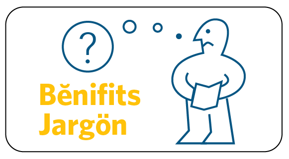
A benefits website helps employees view their benefits as a holistic package, instead of patchwork of providers, administrators, and programs. But if the website isn’t designed intuitively, employees and their family members won’t be able to find what they need. Think about it this way: People think of their benefits in terms of the real-life problems they solve, not in neatly defined categories like ‘health and wellness,’ and ‘financial security.’
One of our clients did a great job of incorporating design thinking when streamlining the main menu of its website for new hires and recruits into just 4 categories:
Start here
This section captures topics like New to Benefits, Benefits Enrollment, Benefits Checklist, and others specific to onboarding. It’s an intuitive choice for new employees—the first place they’ll navigate to on the website—and one that allows them to quickly see the actions they must complete as new employees.
Stay healthy
Here, the client organized its medical plans, wellness program, onsite fitness centers, virtual doctor visits, and other health programs into one easy-to-access menu section.
Let’s talk money
Everything that had a monetary aspect went into this category, which includes life insurance, 401(k), student loans, financial coaching, and more. With this roundup, employees no longer have to navigate multiple menu tabs, but instead can find information about any of these programs within one category.
Stuff you love
Over the years, web analytics for our clients have shown us that pages displaying information about discounts, time off, and other perks are regularly among the top 5 pages that employees visit. We thought about what they had in common and realized they’re all programs people love.
Taking this concept a step further, you can connect real-life scenarios to your other site content, too. Here are some examples:
- I’m a little short on money this month → Financial well-being
- What to do if I cut off a finger? → When to use ER vs. your doctor
- Which medical plan option is the best one for me? → Your 2018 benefits
- What’s wrong with me? → Have you heard about the Employee Assistance Program?
- I need to lose a little weight → Wellness program
Smarter Filters
You can also infuse real life into your content by adding filters that reflect people’s attitudes or moods. For example, in a recent interactive financial wellness quiz we created for a client, the first question asks employees how they feel about their finances (e.g., “great!” “meh,” “uh-oh …”). Their answers help us understand their current financial situation and allow us to serve up content that fits what they’re able to tackle at that time. Employees who respond “uh-oh” start with the basics and take small steps right away to start improving their financial situation. Those who answer “great” receive more advanced topics and actions.
To apply filters to an entire benefits website, consider drop-down menus that reflect employees’ attitudes or moods. This would enable them to customize the site and their entire benefits experience by selecting from a few different styles or themes (angst-ridden nihilist, rose-colored-glasses optimist, etc.). The names of each of the menu items could even reflect those themes and change dynamically to help employees navigate according to how they’re feeling when they visit the site.
Be Creative to Engage
A benefits website is essential to your overall communication strategy. Learn how to build yours in Book I of our ebook series, Unlocking Successful Benefits Communication: A10-Key Framework Every Organization Needs to Get Results.
And remember—IKEA threw the conventional rules out the window. The only restrictions to what your website could be are preconceived ideas about what it should be.
We're proud to work with large employers who recognize the business value of engaging employees in benefits. If you want to learn more, contact us.
