Have you ever looked at a website and felt that something was off? Maybe the navigation was in an unusual place or there were too many pop-ups. Those gut reactions are a part of the user experience.
After studying website design and development, I knew a career in coding was unlikely. However, I was still interested in how we experience websites—what makes a website good or bad, and how do we intuitively know that something is wrong?
I decided to learn more. After researching educational opportunities, I settled on the Usability Analyst Certification from Human Factors International, a global leader in consumer experience consulting. (I passed, by the way!1)
While pursuing my usability certification, the instructor told us about a time when he redesigned a control panel. The team spent months considering the location of all buttons and levers. However, their initial design failed, because they didn’t leave space for the operator’s logbook, a simple error that could have been avoided by observing the operator or asking questions about how they work. This sums up why usability is important: It doesn’t matter how much time and effort you put into a website if you don’t consider the end user.
Why Usability Matters
Usability is the measurement of how efficiently and effectively we can use a product and how satisfied we are with that experience.2
When it comes to website usability, who hasn’t been frustrated when there’s no search bar, a link is broken, or it’s taking too long to find the information you need? With an e-commerce website, that’s a lost sale. With an employee-facing website, it’s a phone call to human resources.
Make the business case for usability: Allocating 10% of a website’s budget toward usability will improve quality metrics, including training time and employee transactions, by nearly 2 times.3
What Issues Are We Seeing?
Here are 5 common usability mistakes we see on employee-facing websites.
1. Clutter. There are a few ways that clutter can impact someone’s viewing experience:
- Choice overload: Too many options make the decision overwhelming.
- Messy interfaces: It’s hard to quickly find the information you want.
- Too much text: Dense blocks of text are unappealing and cumbersome.
Don’t worry about the 3-click rule, a common misconception that if users can’t find what they’re looking for in 3 clicks or less, they’ll become frustrated. It’s been shown that there’s no correlation between the number of clicks and level of satisfaction or ability to find information.4 Instead of focusing on clicks, aim for a progressive, intuitive path to relevant information.
Consider the most important actions you want users to take—that’s what should dictate your home page content and navigation bar options. Anything nonessential should be on a subpage or, better yet, removed from your website entirely.
2. Nothing—or everything—is important. Using eye-tracking software, we know that users view a website starting at the top and, as they go down the page, quickly move to scanning the left side. All the while, users are looking for context clues, like headers and images, for topics of interest.
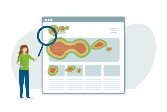
Eye-tracking software measures where users look on a web page.
Good websites are easy to scan, but they have to be created that way intentionally through a hierarchy using headers, bullets, bolded key words, and paragraph breaks to direct people to what’s important.
3. Unpredictable structures. Consistency—both within a website and across all websites—improves the user experience. That’s why many websites feel similar in their design and structure. That’s intentional! You can create a predictable experience by following these rules:
- Don’t reinvent the wheel. There’s no need to have a cool navigation bar along the bottom of the page; everyone looks for it at the top.
- Create a sense of place. Your end user should always know where they are in relation to other pages on the website and how they can get back to where they started. A good example is a breadcrumb trail.
- Use clear, consistent naming conventions. Categories, links, and navigation elements should all be clearly labeled based on terms that users understand.
- Match mental models. Website structure should match what the user believes (rather than what you know is true). For example, an employee might believe compensation falls under benefits, while you know it falls under finance services. Organize your website to reflect where the employee expects to find the information.
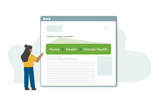
Breadcrumb trails let users know where they are in relation to other pages on the website.
4. Exclusive. During design, accessible websites consider the abilities of all people. That includes accommodations for people who are blind, deaf, color-blind, or have limited mobility. Learn more about improving your website’s accessibility.
5. Unhelpful or nonexistent search bar. According to a study by the Nielsen Norman Group, a leading user experience firm, “search usability accounted for an estimated 43% of the difference in employee productivity between intranets with high and low usability.”5 Your website’s search bar could be directly affecting productivity!
Fix your search by investing in a good search engine that creates a unified index of the entire website and prioritizes the results appropriately. Then, make sure you’re using page titles and summaries to tag content pages. Use your analytics to regularly review the searched terms to ensure users get a result that makes sense.
Start with Usability in Mind
There’s never a better time to prioritize usability than at the start of a project. These quick tips will help you put the user’s experience in the forefront.
- Know your user. Are they internet savvy? Do they prefer nitty-gritty details? Creating a persona of your users can help ensure you’re meeting their needs every step of the way.
- Conduct a test. Usability testing, like card sorting and focus groups, is a great way to get feedback during the prototype stage, before it’s too late to make major changes.
- Don’t stop on launch day. Usability is ongoing and needs to adapt to changing preferences and new technology. Don’t set and forget!
User-focused websites are efficient, effective, and a pleasure to visit. When you put your users first, you’re also putting the company first—happy users are more productive and more likely to come back to your website!
If you’re not sure where to start, consider working with a usability expert to conduct a review or coordinate usability (user) testing of your existing website.
We're proud to work with organizations that value their people. If you want to learn more, we’d love to talk.
1 humanfactors.com/hfi-training/certification/cua_directorylist_byname.asp?listview=lastname&alphabet=A
2 globallogic.com/insights/blogs/world-usability-day-what-is-usability-and-why-does-it-matter/
3 nngroup.com/articles/usability-101-introduction-to-usability/
4 nngroup.com/articles/3-click-rule/
5 nngroup.com/articles/intranet-usability-the-trillion-dollar-question/
Read Next