A robust benefits website that’s built outside the firewall is one of the best investments an organization can make. For potential recruits, new hires, current employees, and household decision-makers, it can be the first look into a company’s DNA and culture. And that first look should start with a home page that’s easy on the eyes and easy to navigate. Your home page is a preview of the experience visitors are about to have on your benefits site, which makes it all the more reason to ensure that your visitors are central to your home page design and that it’s easy for them to find what they need.
We’re delighted to share benefits home pages we have helped our clients build and design. We hope they spark inspiration for developing or enhancing your benefits website.
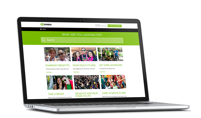
NVIDIA’s benefits website includes bright colors and a prominent search bar
Bright Colors + Prominent Search Bar = A Standout Website
This team’s culture of community and support certainly doesn’t go unnoticed on their benefits website. Instead of stock photos, NVIDIA adds an original touch with energetic photos of the team away from their desks. The entire concept for this particular home page was to quickly get people to what they needed by using a search bar that’s front and center, instead of providing categorized benefits drop-down menus. By making the search both prominent and functional, support for urgent and non-urgent matters is literally just a few clicks away.
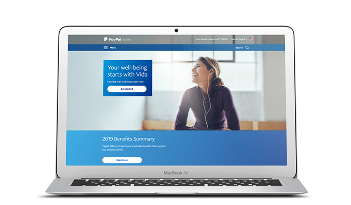
PayPal’s benefits website uses its homepage to promote benefits
Keep Your Most Important Benefits Front and Center
Simple and intuitive. Those are the driving characteristics of PayPal’s benefits website. Add in just the right amount of animation, and the website becomes engaging and elegant. This home page offers several opportunities to promote benefits and wellness programs with a primary space at the top of the page and up to 3 secondary promotions beneath.
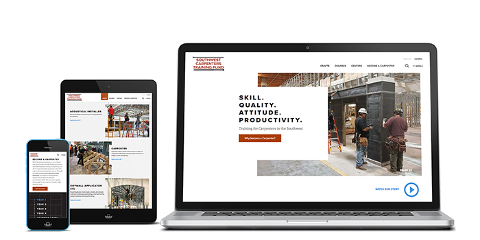
Southwest Carpenters Training Fund’s website reflects its people
A Home Page That Reflects the Community It Represents
Corporate clients aren’t the only ones with benefits sites that delight! The site we recently developed for the Southwest Carpenters Training Fund truly embodies the people it serves—carpenters. It’s where they go for information about health and welfare and retirement benefits, as well as the Fund’s apprenticeship and continued education programs. Information is easy to find, relevant to what’s top of mind for employees, and written clearly and concisely.
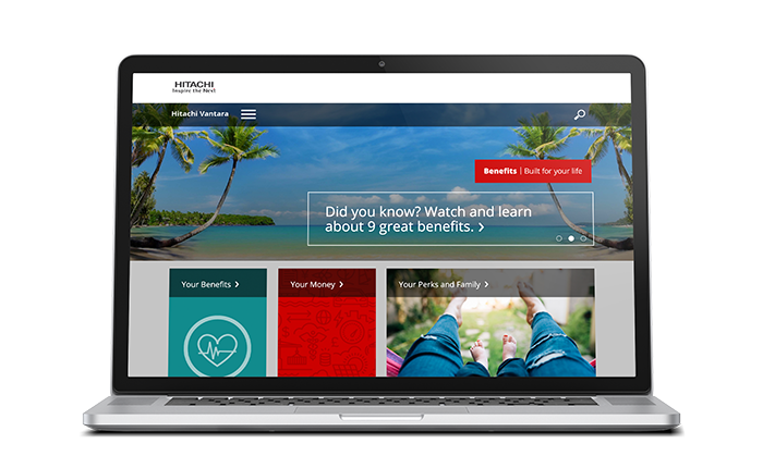
Hitachi Vantara’s home page is organized into 3 distinct benefits categories
Designing a Home Page Around 3 Fundamental Employee Benefits
Hitachi Vantara’s home page is designed around its employees, and it’s organized into 3 distinct benefits categories: Your Benefits, Your Money, and Your Perks and Family. The prominent banner highlights specific benefits that employees may not be aware of, and the news section at the bottom of the page offers visitors quick important benefits-related news.
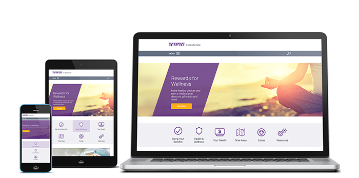
Synopsys’ benefits website makes it easy to find benefits information across every device
Benefits That Are Easy to Find Across Every Device
New hires and longtime employees get the information they need, when they need it, on their first visit to the Synopsys benefits website’s home page. And because the site is optimized for mobile–like all the sites we design–they get the same experience on their smartphone and tablet. Featuring campaigns designed around different benefits throughout the year, this home page averaged nearly 30,000 page views in 2018.
When it comes to your benefits home page, your options are almost limitless! Visually, it should reflect your organization’s brand and serve as an extension of the programs promoted across all channels. You’ll certainly use it to tee up Open Enrollment, but it’s a great place to remind your people of all the programs they can access year-round. Keep them coming back for more by updating your home page frequently. (It also reassures visitors that the information is up to date.)