

Sometimes, all it takes is one look to know the difference between benefits communication that is effective and changes behavior, and communication that falls flat.
As websites become the primary source for benefits and enrollment information, and fewer companies send home lengthy booklets, the print material you do create and distribute needs to be high-impact and focused on achieving results.
It’s too easy, however, for print materials to get crowded with lengthy content that dilutes their value.
Benefits collateral pieces are designed to get someone to pay attention and then to take action. With one look, your reader should know what to do next: Enroll in Annual Enrollment. Stop Smoking. Visit a Website. Take the Health Assessment Test.
The message needs to be bold and easy to read, which is accomplished by creating a clear visual hierarchy along with engaging and concise copy.
So what is visual hierarchy and how is it achieved?
Visual hierarchy helps guide a viewer’s eye through the content by creating necessary focal points. A focal point is the part of the design that is most emphasized. Elements become focal points through size or color.
 Size is interesting to play with because it is not always the largest element that becomes the focal point. Sometimes small elements and ample white space have greater emphasis. It’s up to the designer to be decisive. For example, if different elements in the piece have equal weight, the viewers will be frustrated by different elements pulling their eyes and vying for attention. Viewers will quickly lose attention, and your piece will float to the bottom of their pile of things to read—or worse…the nearest garbage can.
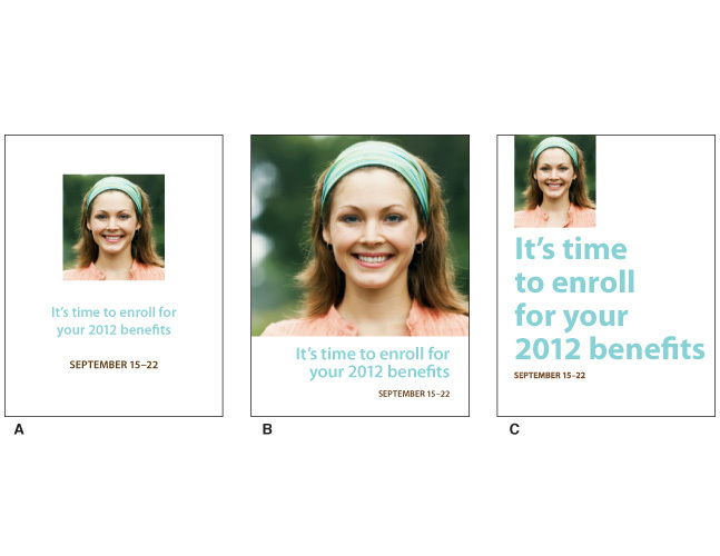
Here is a simple visual of what I mean. Design A has three parts of equal emphasis, the photograph, the headline and the date. There is a visual tug-of-war between each element that makes this piece rather dull.
Designs B and C, while still very simplistic, give the viewer a clear and meaningful point-of-entry to the poster because something has been emphasized. Just like the movies, not every actor can have the leading role. There are leading roles and supporting roles. In visual pieces, typography and design elements should act accordingly.
When saying less is more
Your marketing piece should not hold too many messages for its size. For example, the front of a postcard is prime real estate and should ideally hold just one message. If you want to tell someone to go online and sign up for Annual Enrollment, simply announce Annual Enrollment on the front and use the flip side for the details. If you want to explain a new benefits program as well, you might consider investing in a larger piece to accommodate more information. Pieces that fold are great for this!
And remember, you can draw people to your website for more information as well. If you have a hard time visualizing how copy will work on a visual piece, I recommend communicating your marketing goals with your creative team or design firm to help get your collateral to be as effective as possible.
