The best communicators know their audience. If you don't know who your audience is, you won’t be able to reach its members with your message. This is especially important in times of change. When people are craving information, you need to reach them in the ways they actually consume it.
That’s why we start every client engagement by defining the key personas for the employee audience our clients need to reach with their communications. It’s important to understand that not only do different types of employees need different sorts of information, but they also absorb information in different ways. This is true of all people, which is why successful communications—print, electronic, or web-based—are designed with the user in mind.
Communication can take different formats and be distributed through different channels; one way isn’t necessarily the right way for every person. Think about how you approach a news website. Do you go to today’s headlines? Most popular? Breaking news? Local news? Videos? Do you shy away from links to videos?
When I participated in my first website user testing project in the late 1990s, I was immediately fascinated by how people approached the task of exploring a website. Some people went for the search box and didn’t even glance at the home page or menu bar. Some people sat and looked at the page for quite a while, reading every item on it. Others clicked on the only photo on the test site, and some went straight to the site map listed in the footer.
What I learned then remains not only relevant but also crucial to communications professionals today: People approach information—online and in print—in different ways. As communicators, it’s our job to help accommodate as many of those ways as possible. After all, at the core of user-centered design is the user experience.
Keep user types top of mind
The different ways people approach information drives the way we design a single piece of communication. Were we to create a cheat sheet of persona types and the way they approach new information (when reading a newspaper or a website, for example), here's what it might look like.
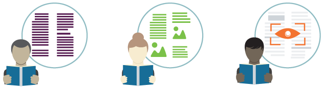
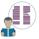 The Orderly (word-oriented)
Reads newspaper front to back, following articles in order. Usually jumps to the continuation of an article, although some of these types will instead read everything on a page before moving on to each story’s jump. On a website, this person quickly gets deeply into the site. The orderly often goes through the main navigation bar page by page and checks out what’s in each section. This type loves downloadable PDFs and nicely formatted pages that they can print and read later. A variant of the orderly is someone who uses a sitemap or carefully studies mega-menus to get an overview of everything that’s on the site.
To reach the orderly: Make sure there are no dead ends on your site and that there is always a place to easily go to next from the end of copy. Don’t make them click through too many pages to get in-depth information, Link to PDFs with more detail, and make it easy to print anything off the site. Adding a way to send a page to a friend via email is a bonus, as many of this type will send a page to themselves to read later. If you’re sending out print pieces, make sure you’re clear and direct about where they can find more detailed information.
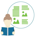 The Nosher (both visually and literary-oriented)
Flips through the newspaper quickly, glances at headlines and pictures, stops and reads the occasional story, then continues to flip. On a website, noshers tend to click around at random, on phrases that stand out to them. They skim bulleted lists and read headlines. They move quickly through a site, and diligently avoid dense text blocks. Images also appeal to this type. Some noshers like video. But don’t make them longer than two minutes or you’ll lose them.
To reach the nosher: Across all media make your content easy to scan. Use bulleted lists, strong headlines, and lots of graphics. On the web use video.
 The Achiever (topic-oriented with a purpose/focus)
Skips directly to the newspaper section they are interested in and ignores the rest. On a website this person uses the search box to find exactly what they’re looking for. If they are the more patient type, they'll scan the mega menu or sitemap to find the page with the answer they are looking for.
To reach the achiever: Make sure your site’s search functionality is up to snuff—that it indexes correctly and that all your PDF documents have descriptive titles that show up in search results. Quick links on a home page can be useful, too. The achiever will also appreciate a feature area for commonly accessed pages. To determine what to include in this area, use analytics—look for the pages people access most and common search terms. A mega-menu or site map will endear you to this type, as they can quickly see what's on the site and deduce where to go.
Take yourself out of the picture
There are many variations within each type, and, of course, there is the occasional person who won’t fit into any type because they change their style each time they pick up a paper or go to a website. The point is not whether these categories are right or broad enough—or even who fits into them; rather, it’s the importance of recognizing that others may approach information in a way that’s different from your approach.
As a communicator you need to understand this for a couple of reasons:
- When you’re reviewing communications, it’s important to see them through multiple lenses and not just the one you use for approaching information.
- What you’re communicating needs to be presented so that it makes sense to any and all of the types above and their variations. If you’re designing a print piece and you organize it so that it needs to be read in order, from steps 1 through 6, you can be sure it won’t be read by all your audience types.
So, when you’re communicating something as important as changes to benefit plans, company policies, or instructions for enrolling in benefits, the content needs to be organized in a way that works for all your employees. This means thinking things through from the beginning and selecting the print format best suited for the type of information you are communicating, regardless of how it’s been done in the past. If you don’t have flexibility in your print format, you’ll need to craft your content so that it caters to a variety of information approaches.
How does this work in real life?
Checklists for getting the most from print and online communications
For print
- If the information is dense and complicated, give it lots of space.
- Use call-outs to highlight important information (for the noshers and achievers).
- Include visual representations of complicated concepts (for all audiences, but especially noshers and achievers).
- Repeat important facts (e.g., deadlines, where to go for more information), altering the phrasing each time, both to reach people who merely skim content and to appeal to those with different literacy and comprehension skills.
For web
- Make sure all pages can be easily reached from anywhere.
- Consider the use of mega-menus in your main navigation or include a sitemap.
- Ensure your search functionality is great.
- Refine your site section names and sub pages to reflect what employees search for.
- Don’t have any orphan pages that can only be reached from one or two other pages.
- Make the pages easy to scan by mixing images with text blocks, bulleted information, and informative headlines.
- Mix content-intense pages with videos and graphics that highlight and summarize what’s in the dense content. It’s okay to have different depths of information across information paths (text, graphics, video)—but the most fundamental and important information should appear in all media channels you use.
- Encourage people to dig in deeper if they want more detail, and provide it for them.
- Have downloadable and printable PDFs for those who want to take things on the road on paper.
- Make it easy to forward a page to a friend.
- Make it easy and engaging to get from one section to another, never leaving a user at a dead end, without a clear path for where to go next.
Applying these parameters to your print and web deliverables will help ensure that what you’re communicating will be received in the ways your targeted audiences take in information. It’s the foundation for benefits engagement and the cornerstone of the web experience that we create for clients. Intuit is a prime example of that. We can do this for you, too.