Responsive Web Design for benefits communication websites—Our latest obsession
The word obsession might be a little too strong here, but we are definitely into Responsive Web Design (RWD) in a big way lately. We’ve been designing and building websites for our clients for years now, and we’re constantly on the lookout for something “new” to include in our builds.
Enter RWD. What is it, you ask? The name is actually pretty self-explanatory. RWD is a method of designing websites that respond to their environment. When a user switches between devices—say from a laptop to a tablet, or tablet to a mobile phone—they see the website in the most optimal layout for that particular device. This visual switcheroo happens through the use of flexible grids and layouts, which serve up images at the appropriate size, navigation location and functionality, and the hierarchy of the content displayed. All this is determined by the resolution of the device in use.
The use of RWD eliminates the need for designing a separate version of your website for mobile or tablet users. Everyone sees the same site; it’s just displayed differently. An easy way to think about RWD is as an adaptive website that will change the view of your site to what works best for the device you’re using to access it.
RWD still allows users to:
- Navigate the site
- Download PDF files
- Watch videos
- Search the website’s contents
- Dial a phone number or click on a map via tagged content
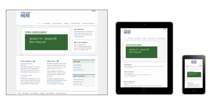
Obsession worthy? We think so. That’s why we’ve built Bento, our new benefits website solution with RWD. Here, you can see how the same site is displayed differently on a computer screen, tablet and mobile phone.
There are a bunch of great examples of RWD out there. If you want to see it in action, visit one of these websites on your laptop or desktop computer, then drag your window to a smaller size to mimic a tablet or a phone. You’ll see the layout change right before your eyes.
Want one of your very own? You can have it with Bento!

Caroline Lowry, VP Senior Project Manager, has been part of the Segal Benz team since 2006 and currently manages some of our largest engagements.

