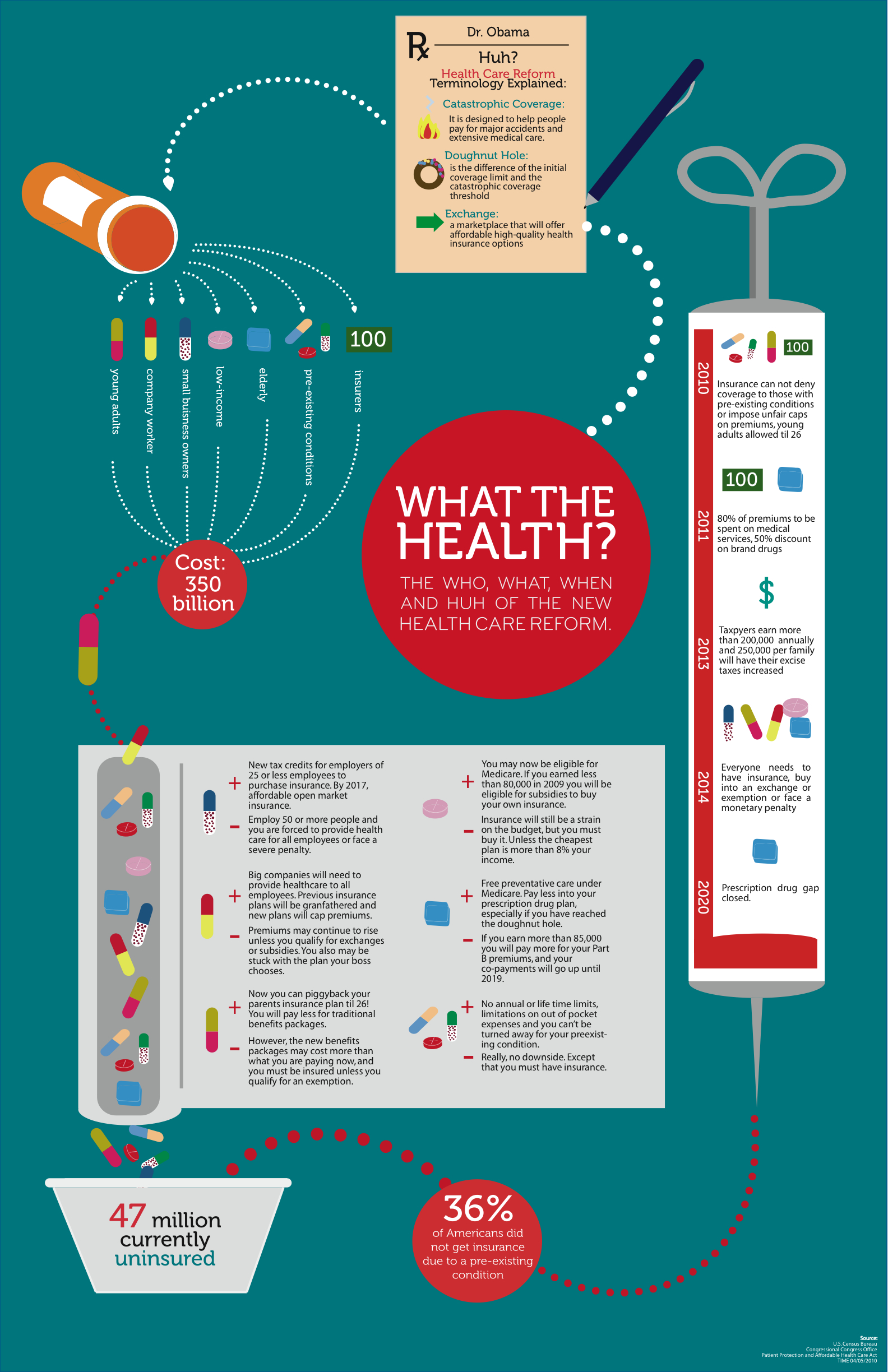
Shortly after the Affordable Care Act was signed into law, GOOD—an online community that aims to drive local collaboration and grass-roots progress—hosted a “transparency contest.” The challenge? For graphic designers to create an infographic to illustrate the groundbreaking legislation. Click here to view all of the winning and finalist entries.
As you scroll through, consider taking a similar “less is more approach” to your ACA communications. It’s okay—and probably best!—to communicate in the plainest, simplest way you can. The message gets across just as well—the infographics from the GOOD contest like the finalist posted below are proof-positive.
Do you have an infographic or story of your own about plain-language ACA communications? Share it in the comments!